Mobile-First Indexing: What It Means and How to Prepare Your Site
Most searches now happen on phones, and Google’s indexing reflects that. With mobile-first indexing, Google primarily uses the mobile version of your site to understand and rank your pages. Here is what that means for you.
What Is Mobile-First Indexing?
Mobile-first indexing means Google predominantly crawls and indexes the mobile version of a page. If content is missing from your mobile version, Google may not see it at all. Google has completed the move to mobile-first indexing for the web, so this applies to virtually every site.
Does It Mean Desktop Doesn’t Matter?
No. Desktop users still see your desktop site, and both experiences matter to real people. But for Google’s understanding of your content, the mobile version is what counts.
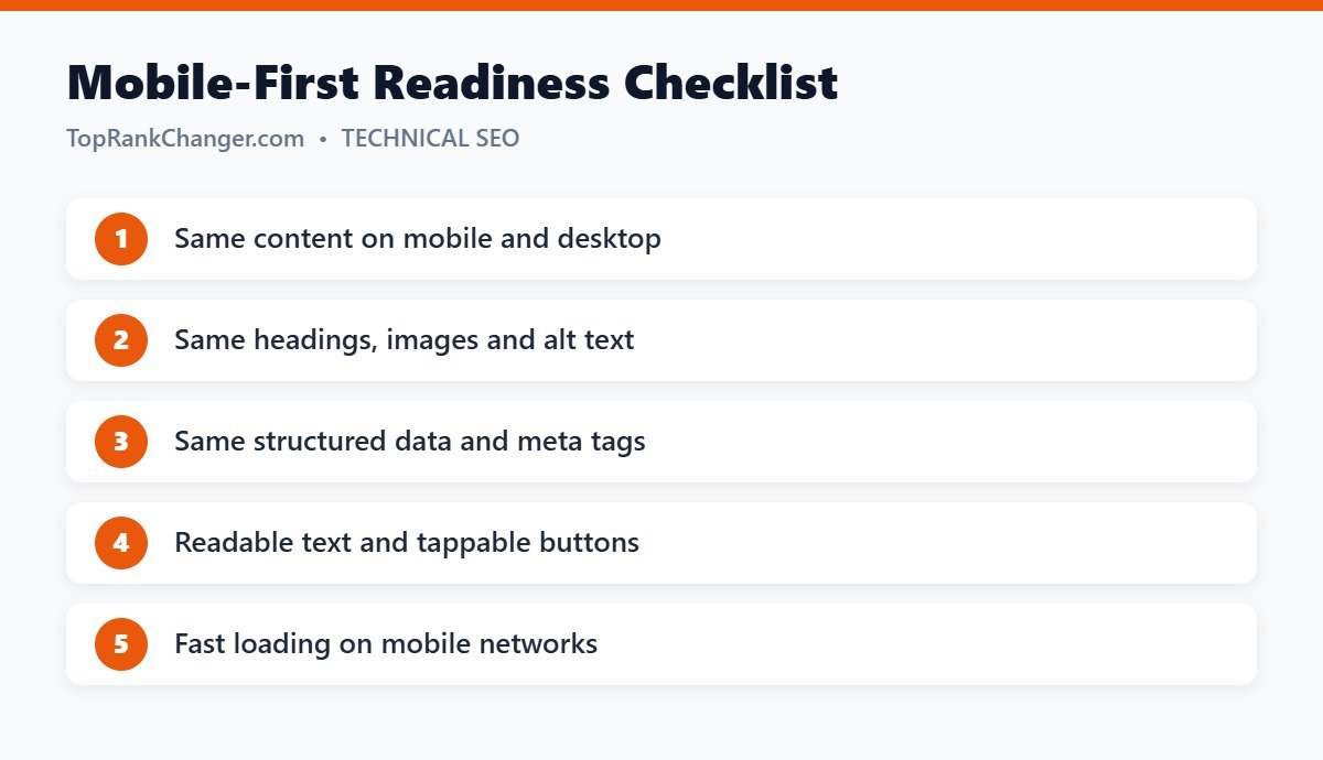
How to Prepare Your Site
1. Use a responsive theme
A responsive design serves the same HTML to all devices and adapts the layout with CSS. It is Google’s recommended approach and the default for modern WordPress themes.
2. Keep content consistent
Don’t hide important text, images or sections on mobile. Content in tabs or accordions is fine as long as it is in the page’s HTML.
3. Match metadata and structured data
Titles, meta descriptions, headings, alt text and structured data should be the same on both versions.
4. Make it usable
- Text readable without zooming (around 16px or larger)
- Buttons and links with enough space to tap
- No content wider than the screen
- No intrusive pop-ups covering content
5. Make it fast
Phones often use slower connections. Compress images, limit scripts and use caching. See Core Web Vitals explained.
6. Don’t block resources
Make sure robots.txt doesn’t block CSS, JavaScript or images needed to render the mobile page.
How to Check
- Open your pages on a real phone and read them as a visitor would.
- Use the URL Inspection tool in Search Console to see how Googlebot Smartphone renders the page.
- Run PageSpeed Insights and check the mobile results.
Final Thoughts
If your site uses a modern responsive theme and shows the same content on every device, you are most of the way there. Focus on speed and usability on small screens, and your site will be ready for how people actually search.